Common Flyer Printing Mistakes & How to Avoid Them
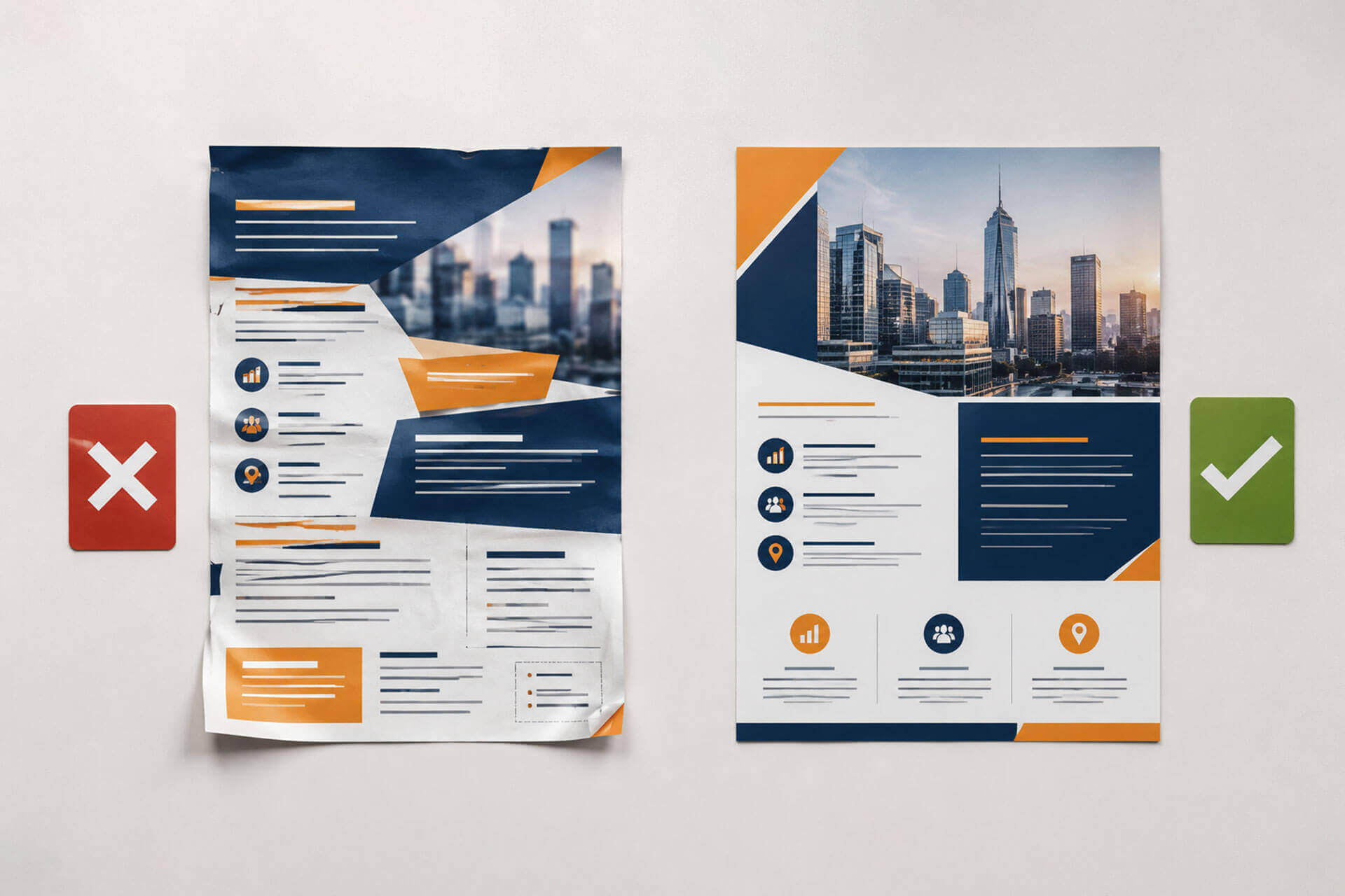
A well-designed flyer can grab attention, promote an offer, and give potential customers a clear reason to take action. However, even a great design can go wrong due to simple printing mistakes. The result can be affected by poor quality images, inappropriate paper, file settings, or overly filled layouts.
By learning what to look for before sending your artwork to print, you can prevent further delays, additional costs, and less-than-appealing results.
Choosing the Wrong Paper
Paper can impact the look and feel of a flyer; for example, a light stock can be useful for bulk distribution, whereas a heavier stock can provide a more robust and impressive appearance to promotional materials.
So, what is the best paper for flyer printing? This will depend on the use of the material. Glossy paper can brighten photographs and colours; matte paper will give a softer, less reflective finish. When selecting a stock, consider where the flyers will be distributed, how long they should remain in place, and the impression you want.
Using Low-Resolution Images
Have you ever seen a clear image on a monitor, had it printed, and it still isn’t clear? This frequently occurs when a low-resolution image is magnified beyond the image’s appropriate size.
Photographs, logos, and graphics should be created to the correct resolution and size for the required print size. Do not stretch small images to fill large spaces, as the image may become pixelated and appear less detailed.
For business flyer printing, it is crucial to have clear pictures and distinct branding that can impact a company’s impression.
Forgetting Bleed and Safe Margins
When a design runs right to the edge of the flyer, it needs bleed, meaning the artwork should extend slightly beyond the final size. This extra area is trimmed away during printing. Without enough bleed, even a small shift while cutting can leave a thin white line along the edge.
The trim area is basically where the printer will cut the flyer down to its finished size. Important details such as headlines, logos, contact information, and calls to action should be kept inside the safe zone, which is the space set a little further in from the trim line. This gives your important content some room and lowers the risk of anything being cut off.
These details can be easy to miss if you’re new to preparing files for print, but checking them before submitting your artwork can save you from avoidable printing issues.
Putting Too Much Information on One Flyer
A flyer has limited space, so trying to include every detail can make it difficult to read. Multiple headlines, lengthy paragraphs, excessive graphics and competing offers can quickly overwhelm the reader.
Start by identifying the main message. Whether you are promoting a sale, announcing an event, or introducing a service, make the most important information easy to spot. Arrange supporting details around that central message rather than letting them compete with it.
Effective marketing flyers tend to be easier to understand when they’re focused, and the reader can easily see what it’s about and what they should do next.
Ignoring the Difference Between Screen and Print Colours
The colors you see on screen may differ from the colors when you print them. Generally, screens are set up in RGB and commercial printing is set up in CMYK.
This variation may impact the final color of specific colors on the product. When brand colors play a major role in the design, it is essential to create artwork in the intended printing method. Reviewing colours prior to production can minimize unwanted outcomes.
Submitting the Wrong File Format
File preparation is another area where small mistakes can create unnecessary problems. So, what file format is best for flyer printing? A print-ready PDF is usually the preferred option, as it can maintain the layout, fonts, images, and other design features of the document.
Review the document dimensions, image quality, bleed and font handling before sending artwork. Additionally, be sure to adhere to the printer’s file specifications, as these may differ from one printer to another and from one printing process to another.
Designing Without Considering Where the Flyer Will Be Used?
Not every flyer is created equal. A restaurant promotion, trade show handout, retail sale, and corporate announcement may require very different approaches.
Think about the audience and distribution method before finalising the design. A flyer that’s given directly to a customer might require a different format to the one on the counter or storefront. The information, visual hierarchy, and call to action should match how and where the information will be viewed.
Considering the end use from the beginning helps ensure the finished piece is practical as well as visually appealing.