The Psychology of Color: How Colors Influence Emotions
Colour can influence how we perceive a space, product, brand, or piece of artwork. Certain colours may feel energetic, calming, serious, or playful, but our responses are not determined by colour alone.
Colour psychology looks at how visual colour can affect perception, emotion, and behaviour. These responses can be influenced by personal experiences, cultural associations, context, and even the other colours used alongside it. Understanding these factors can help when choosing colours for branding, advertising, interiors, and printed materials.
What Is Colour Psychology?
It is the study of how people respond to different colours and colour combinations. Some associations appear frequently across different settings, while others vary between individuals and cultures.
For example, red is often associated with energy, danger, passion, or urgency. Blue is commonly linked with trust, calmness, and professionalism. These associations can influence how people interpret a design, but they do not guarantee a particular emotional or behavioural response.
The context matters. A bright red used on a sale sign can create a very different impression from a deep red used in a luxury brand.

How Warm Colours Affect Perception
Warm shades such as red, orange, and yellow tend to attract attention and can give a design an energetic or lively appearance.
Red
Red is visually prominent and is often associated with passion, excitement, urgency, and danger. This makes it common in warning signs, promotional graphics, food packaging, and calls to action.
However, red does not automatically make people act faster or buy something. Its effect depends on the message, design, audience, and surrounding elements.
Orange
Orange can create a friendly, energetic, and approachable impression. It is often used when a brand wants to appear youthful, active, or playful.
Because orange is highly noticeable without being as visually intense as some shades of red, it can work well for promotional materials and designs that need to attract attention.
Yellow
Yellow is commonly associated with warmth, optimism, and energy. Bright yellow can stand out strongly against darker colours, making it useful for highlights and attention-grabbing elements.
Too much bright yellow, however, can make a design feel overwhelming. Using it selectively can create better visual balance.

The Associations of Cool Colours
Blue, green, and some shades of purple are often described as cool shades. They can give designs a calmer or more sophisticated appearance, although individual responses vary.
Blue
Blue is frequently associated with trust, stability, professionalism, and calmness. It is common in corporate, technology, financial, and healthcare branding.
Different shades can create different impressions. A dark navy may feel formal and established, while a bright blue can appear more modern and energetic.
Green
Green is strongly associated with nature, growth, freshness, and renewal. It is often used by environmental, health, food, and wellness brands.
Its meaning can also change depending on the shade. Dark green can suggest tradition or luxury, while lighter greens may feel fresh and youthful.
Purple
Purple is often associated with creativity, luxury, imagination, and sophistication. Darker shades can create a more dramatic appearance, while lighter versions can feel softer.
Because purple combines visual qualities associated with both red and blue, it can work across a wide range of creative and branding styles.
What About Black, White, and Grey?
Neutral shades can be just as important as bright ones.
Black can communicate sophistication, authority, simplicity, or drama. It is frequently used in luxury branding and minimalist designs.
White is often associated with cleanliness, simplicity, and openness, but its meaning varies between cultures and contexts.
Grey can create a neutral, professional, or understated appearance. It is often used alongside brighter colours to provide visual balance.
The meaning of any neutral colour can change considerably depending on the typography, imagery, layout, and other colours around it.
How Colour Influences Branding and Marketing
It can help businesses create a recognisable visual identity and establish a particular tone. A company might use a consistent shade palette across its logo, packaging, website, signage, brochures, and other marketing materials.
However, there is no universal shade that makes customers trust a brand, purchase a product, or take a specific action. Shades work as part of a larger design system.
When choosing them for marketing materials, consider:
- What the brand wants to communicate
- Who the intended audience is
- Where the material will be displayed
- How the colours work with the brand identity
- Whether the text remains easy to read
- How the colours reproduce in print
The final point is particularly important for printed materials because they can appear different on screen and on paper.
Why Cultural Context Matters
Colour meanings are not universal. A shade that represents celebration or purity in one culture may have a very different association somewhere else.
White, for example, is commonly associated with weddings and purity in many Western contexts, while it has associations with mourning in some East Asian cultures.
Brands working across different regions should therefore research the cultural context of their audience instead of assuming that a particular colour will communicate the same message everywhere.
Can Colour Affect Mood?
It can contribute to the atmosphere of a room or visual environment, but it is too simplistic to say that a particular shade will reliably improve someone’s mood or productivity.
Lighting, saturation, brightness, personal preference, cultural background, and the purpose of the space all matter. A soft blue bedroom may feel relaxing to one person, while another may prefer warm neutral tones.
For interior design, the goal should be to consider colour alongside the overall environment rather than treating it as a standalone psychological tool.
Colour in Printed Materials
The choices become especially important when designing brochures, posters, business cards, packaging, signage, and other printed materials.
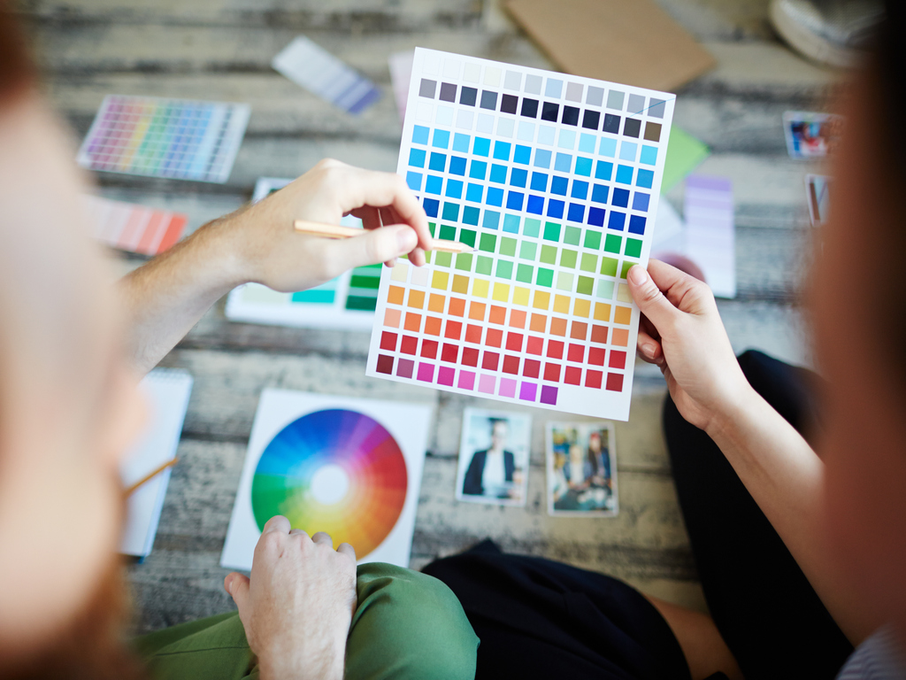
A shade palette that looks good on a computer screen may not reproduce exactly the same way in print. Paper type, ink, finishing, and the printing process can all influence the final appearance.
Before producing a large print run, reviewing a proof can help identify issues with the contrast and readability.
Conclusion
Colour can shape the way people perceive a design, but its psychological effects are not universal or predictable in isolation. Personal experience, culture, context, shade combinations, and the purpose of a design all influence how a colour is interpreted.
For businesses, the most effective approach is to use colour as part of a broader visual strategy. A thoughtful colour palette can reinforce brand identity, establish the right tone, and make printed materials more visually effective.
If you need professional printed materials for your business, Triboro Printing provides business printing services in NYC for a range of marketing and business applications.
FAQs
A: There is no single colour that has the strongest psychological effect for everyone. Responses depend on factors such as brightness, saturation, context, culture, and personal experience.
A: Colour can influence how people perceive branding and marketing materials, but it does not guarantee a particular response. Its effectiveness depends on the audience, design, message, and context in which the colour appears.