How Do You Design Flyers That Drive Sales?
Today, flyers remain a powerful, tangible tool for driving sales — especially for local businesses, events, and promotions. Studies show that well-designed print materials can boost response rates by up to 40% compared to generic ads, as they create an immediate, hands-on connection with potential customers. But the key to turning a flyer or a banner into a sales driver lies in strategic design: one that captures attention in seconds, communicates value quickly, and compels action. This guide draws from expert insights to walk you through the process, helping you create flyers that not only stand out but convert browsers into buyers.
Understand Your Audience and Set Clear Goals
Before sketching a single element, define who you’re targeting and what you want to achieve. Are you promoting a flash sale to young urban professionals or a service discount to families in a suburban neighborhood? Tailor your design to resonate with their pain points and preferences — vibrant, playful visuals for a trendy cafe, or clean, professional layouts for a consulting firm.
Set specific, measurable goals like “generate 50 new leads” or “increase foot traffic by 20%”. This focus ensures every design choice supports sales outcomes, rather than just looking pretty. For instance, if urgency is key, prioritize elements that evoke scarcity.

Craft Compelling, Benefit-Focused Copy
Your words should sell the transformation, not just the product. Start with a bold headline that grabs attention in under three seconds — think “Slash Your Energy Bills by 30% Today!” instead of “New Solar Panels Available.” Keep body text concise: use bullet points to highlight benefits (e.g., “Save Time • Boost Efficiency • Cut Costs”), limiting it to 100-150 words total.
Incorporate psychological triggers like scarcity (“Limited Stock—Act Now!”) or reciprocity (offer a free sample with purchase) to nudge decisions. Always end with a clear call to action (CTA): “Scan QR Code for 15% Off” or “Call Today: 555-1234”. Short, actionable copy paired with white space prevents overwhelm and guides readers toward conversion.
Select Eye-Catching Visuals and Colors
Visuals are your flyer’s hook — aim for high-resolution images that evoke emotion and relevance, like a steaming coffee cup for a cafe promo or satisfied customers for a gym deal. Avoid stock photos that feel generic; opt for custom shots or diverse, relatable faces to build empathy and trust.
Leverage color psychology: reds and yellows spark urgency for sales (e.g., clearance events), while blues foster trust for services. Stick to 2-3 brand-aligned colors for cohesion, using contrast — like white text on a deep background — to make CTAs pop. Incorporate icons or custom illustrations to break up text and illustrate benefits, such as a shopping cart for discounts, making complex offers scannable at a glance.
Master Layout and Design Principles
A cluttered flyer gets tossed; a balanced one sells. Follow the Rule of Thirds: divide your layout into a 3×3 grid and place key elements (headline, image, CTA) at intersections for natural eye flow. Create a focal point with scale — make your headline 2-3 times larger than body text — and use white space (at least 20-30% of the design) to breathe life into the composition.
Limit fonts to two or three: a bold sans-serif for headlines and a clean serif for details. Add directional cues like arrows or implied lines (e.g., a model’s gaze) to lead eyes from headline to CTA. For variety, experiment with shapes — semi-transparent overlays on busy backgrounds or grids for product comparisons — to highlight deals without chaos.

Incorporate Proven Psychological Tricks
Design isn’t just aesthetic; it’s behavioral science. Use these seven tactics to subconsciously drive action:
- Color influence: Reds for urgency in sales flyers; blues for calming service promos.
- Human connection: Feature diverse, smiling faces to evoke positivity and relatability.
- FOMO effect: Phrases like “Only 10 Spots Left” trigger quick responses.
- Contrast for focus: Bold CTAs against contrasting backgrounds draw immediate attention.
- Guided attention: Arrows or eye lines point viewers to purchase info.
- Reciprocity: Freebies (e.g., “Buy One, Get Sample Free”) create obligation to buy.
- Social proof: Add a quick testimonial like “Loved by 500+ Locals!” for credibility.
These elements can lift engagement by 20-30%, turning passive glances into active pursuits.
Include Trackable Elements and Test Iteratively
To measure sales impact, embed QR codes linking to a promo page or unique discount codes (e.g., “FLYER20”). This tracks ROI directly — scan rates often correlate with 15-25% conversion uplifts.
Proofread rigorously, then test: print a small batch, distribute in your target area, and A/B compare versions (e.g., red vs. blue CTA). Tools like Adobe Express or Venngage offer free templates to prototype quickly. Refine based on feedback: if uptake is low, simplify copy or amp up visuals.
Avoid These Common Pitfalls
- Overloading info: Stick to one core message — more leads to confusion.
- Ignoring mobile scanning: Ensure QR codes and text work from afar.
- Skipping branding: Consistent logos and colors build recognition over time.
- Forgetting distribution: Pair great design with targeted drops (e.g., high-traffic spots) for max reach.

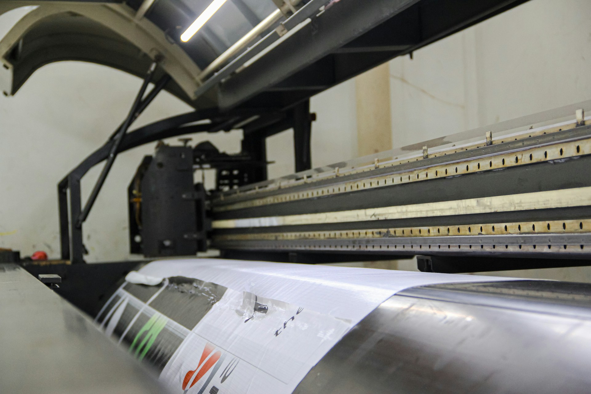
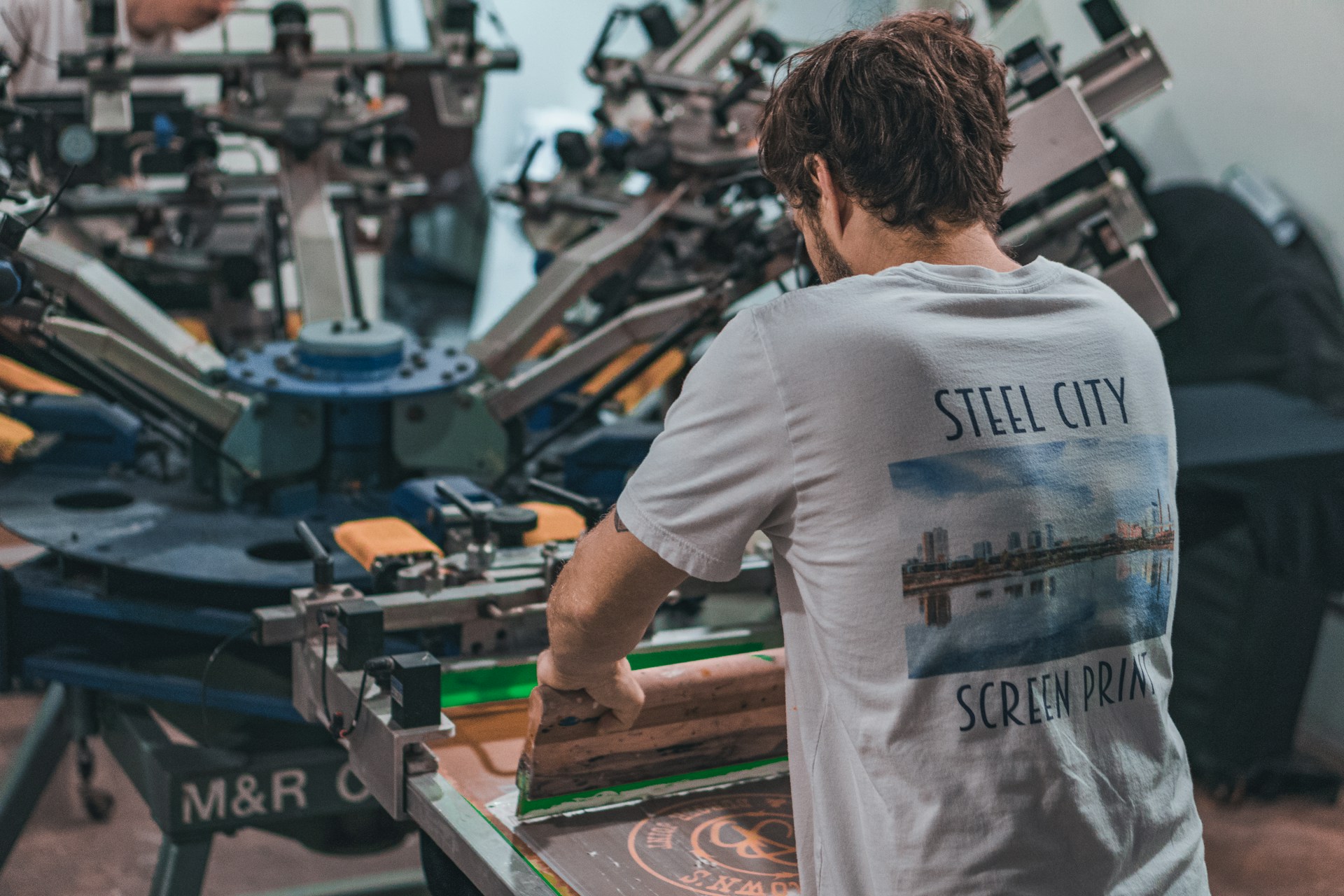
Choosing a Printing Partner for Your Flyers
Once your design is polished, a dependable printer ensures quality execution without delays. Triboro Printing is a solid option for New York-area creators, with over 15 years handling everything from flyers to signage. Their full-service approach includes in-house design assistance for mock-ups if needed, fast turnaround (even same-day for essentials), and on-site installation for larger campaigns — streamlining the process so you focus on sales. Clients often highlight the team’s responsiveness and quality control, which minimizes reprints and keeps projects on budget, making it easier to scale promotional efforts effectively.
FAQ
Budgets vary widely, but small businesses often invest $200–$500 for professional design and $100–$300 for printing a few hundred copies. Larger runs bring down the per-unit cost, making it cost-effective for mass distribution. The key is balancing quality with reach, ensuring your flyers look polished while still fitting your budget.
Yes — studies show flyers remain one of the most effective local marketing tools, boosting response rates by up to 40% compared to generic ads. Unlike digital promotions that can be scrolled past, flyers offer a physical, hands-on reminder of your brand. When designed strategically, they complement online campaigns and reinforce your message.
Common flyer sizes include 8.5”x11” (standard letter) and 5.5”x8.5” (half-sheet). Standard sizes are easier to print and distribute cost-effectively, while custom shapes or oversized formats help stand out in crowded markets. Choose based on your message — detailed offers benefit from larger space, while simple calls-to-action work well on compact formats.
Hiring a designer gives you tailored branding and unique visuals, ideal if you want to stand apart from competitors. Templates, available through tools like Canva or Adobe Express, can work for budget-conscious businesses but risk looking generic. A hybrid approach — starting with a template and refining with professional tweaks — often balances cost and originality.
Trackable elements like QR codes, promo codes, or dedicated landing pages reveal how many leads or sales your flyer generates. You can also measure impact by asking new customers where they heard about your business. Over time, comparing conversion rates across designs helps refine your strategy and maximize ROI.
Effective distribution depends on your audience: busy street corners and transit hubs for urban promotions, local cafes and gyms for community events, or direct mail for targeted households. Pair distribution with timing — for example, dropping event flyers 1–2 weeks before the date. Strategic placement ensures flyers reach people most likely to act on your offer.